Microsoft Bing
With over 100 million active daily users, Bing serves as the world's second-largest search engine. Whether you want to know what the word '"ephemeral" means or how old the sun is, Bing is your gateway to knowledge.
I led the design direction for two segments on Bing: The Jobs vertical and Dictionary vertical.
Timeline
From explorations to final designs in 8 weeks while working with multiple projects at the same time
Team
Gordon Reynolds - SWE
Venky Garikipati - SWE
Nadiya Klymenko - SWE
Ariane Evans - PM
Hui Zhang - PM
A lot of room for improvement
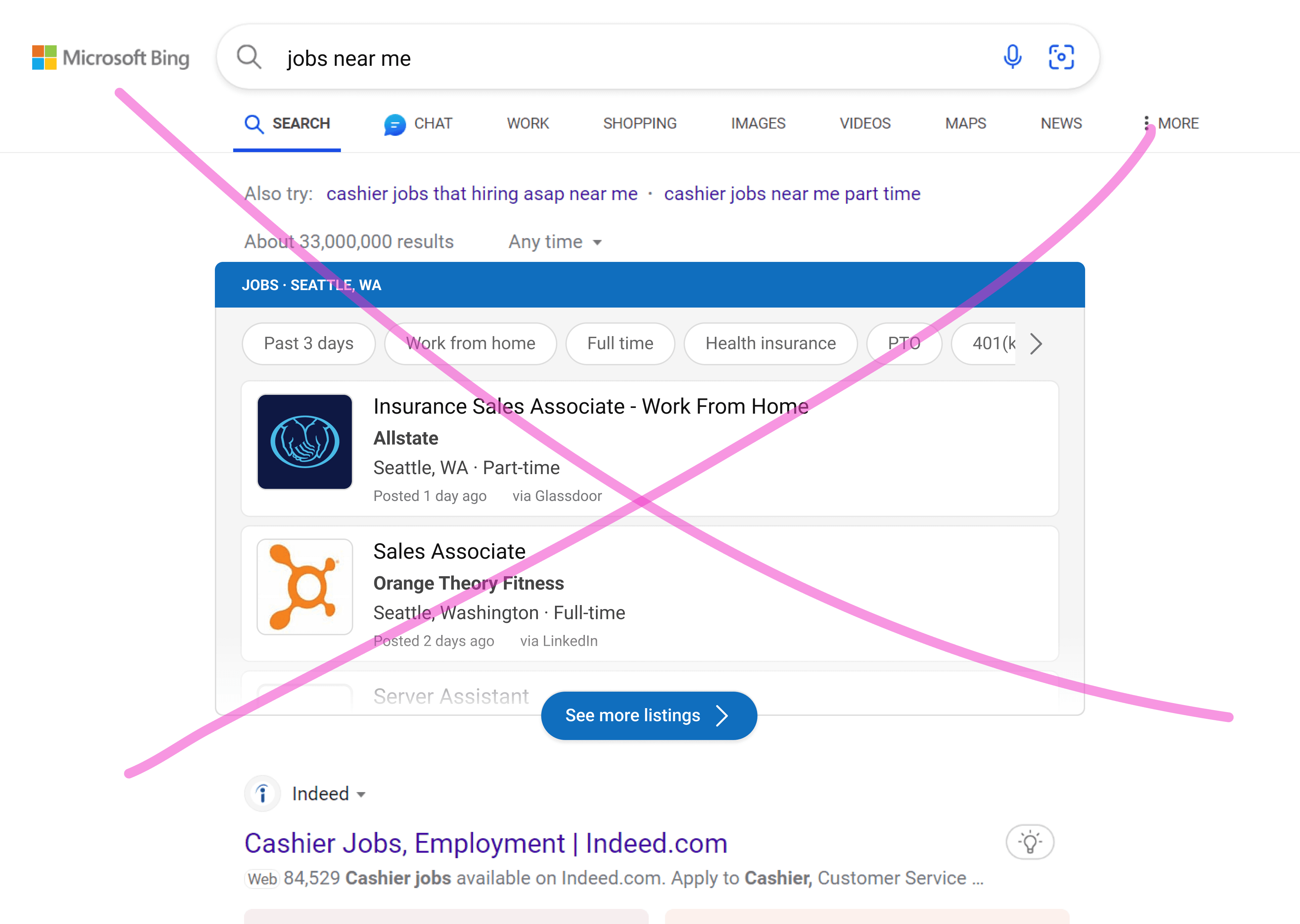
With the current design, users were only able to see two full job cards and were presented with stacks of information. Along with that, our team was now able to pull additional key data (salary, benefits, etc.) from job listings that were missing from these designs.
How can we improve our answer?

Not enough job cards shown.
Only two cards were shown by default.

Information overload.
Stacks of information can be overwhelming.

Limited by answer height.
Working with a height constraint of 375px or less.

Missing key data.
Needed to add new data points to our answer.

Iteration 1.0
After identifying what we needed to improve, I went ahead and explored different redesign options for the job cards.
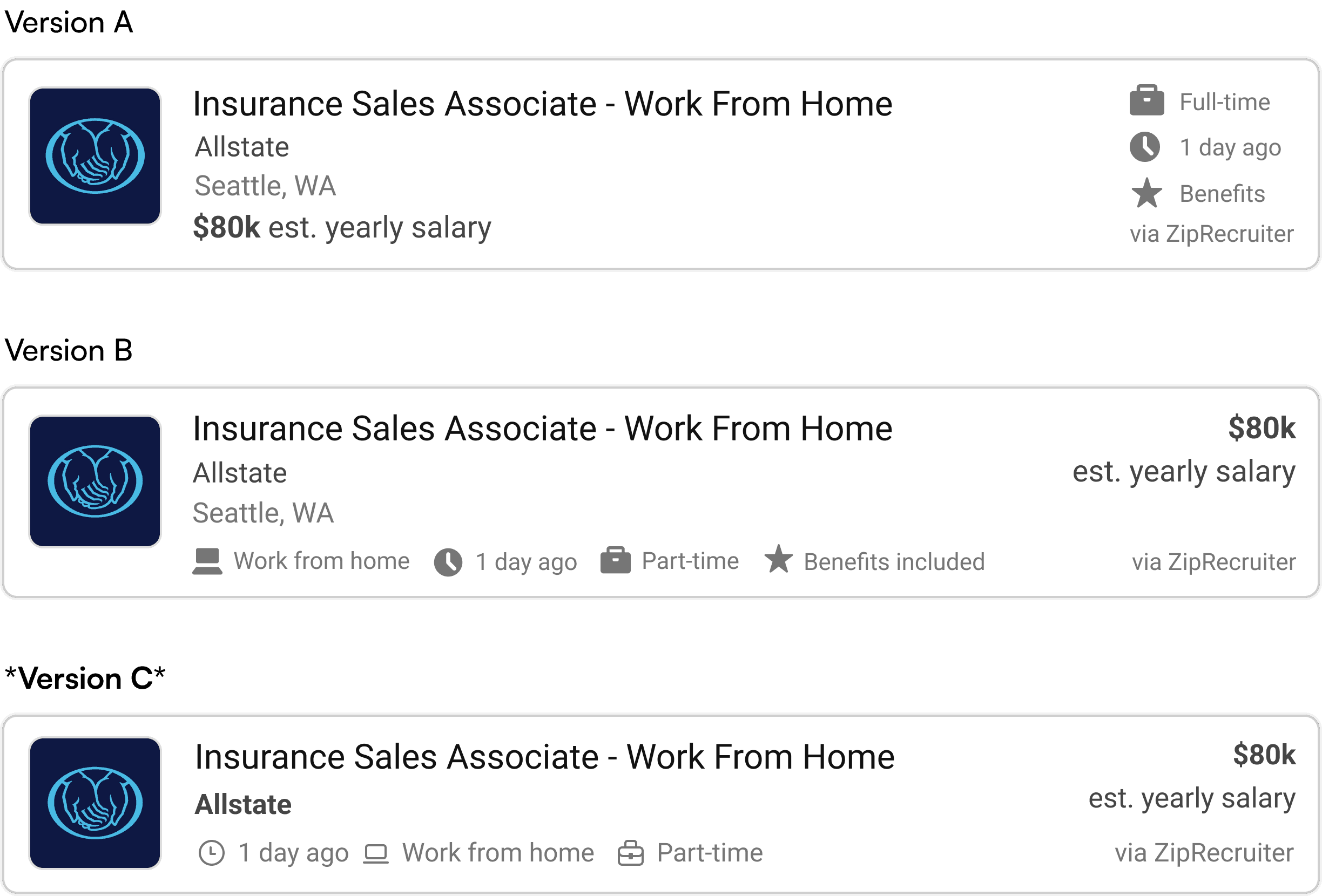
• In Version A, I added the key information that was missing and added icons to better organize information and help users more easily scan the metadata in the card. However, this only allowed us to include 3 pieces of metadata at most, so I moved the metadata to the bottom of the card (Version B).
• Although Version B affords us more space, the filled icons cause the design to look outdated, so I replaced them with outlined icons from our design system.
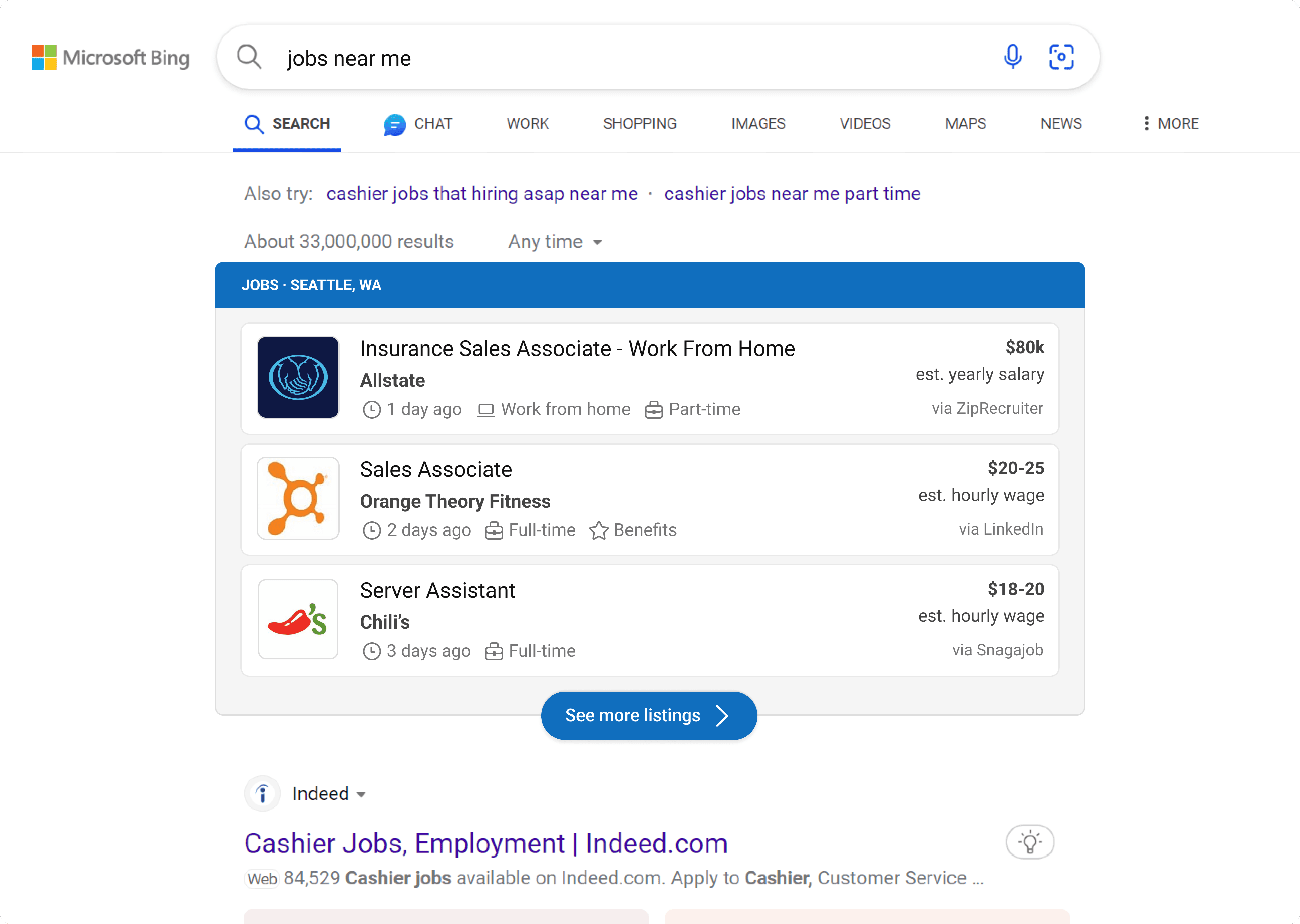
Which lands us on Version C, our final card redesign.
Iteration 2.0 - Cardless jobs exploration
I explored an option where we removed the cards that the jobs are currently placed in with the possibility of making the answer look cleaner as well as reducing vertical height of the answer (a factor that ranks us higher in the whole page algorithm so that our answer appears at the top of the page).
However, after running metrics for a few days, our answer actually received less clicks. We hypothesized that our users were too trained to our Jobs container which has maintained a grey color.
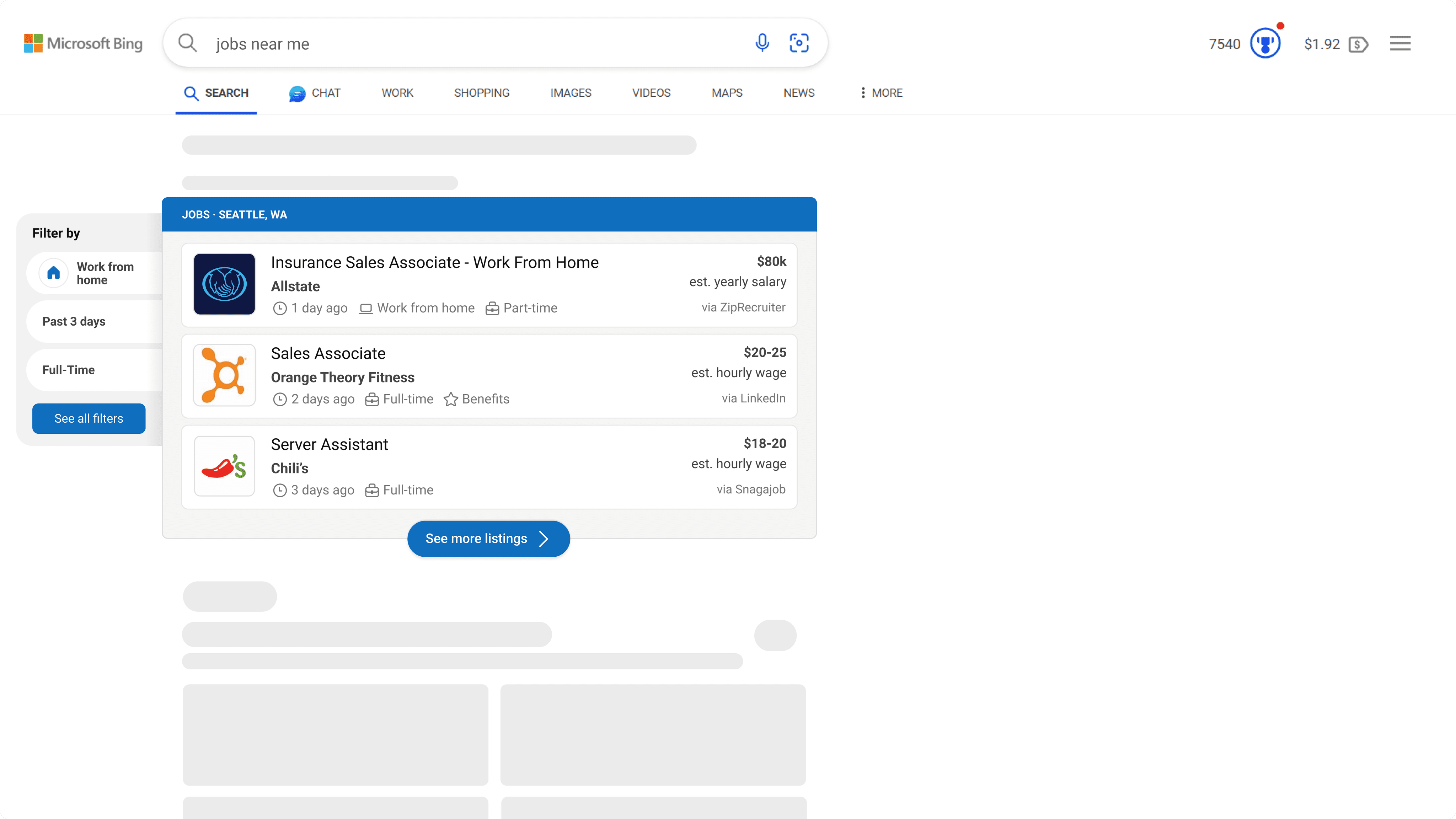
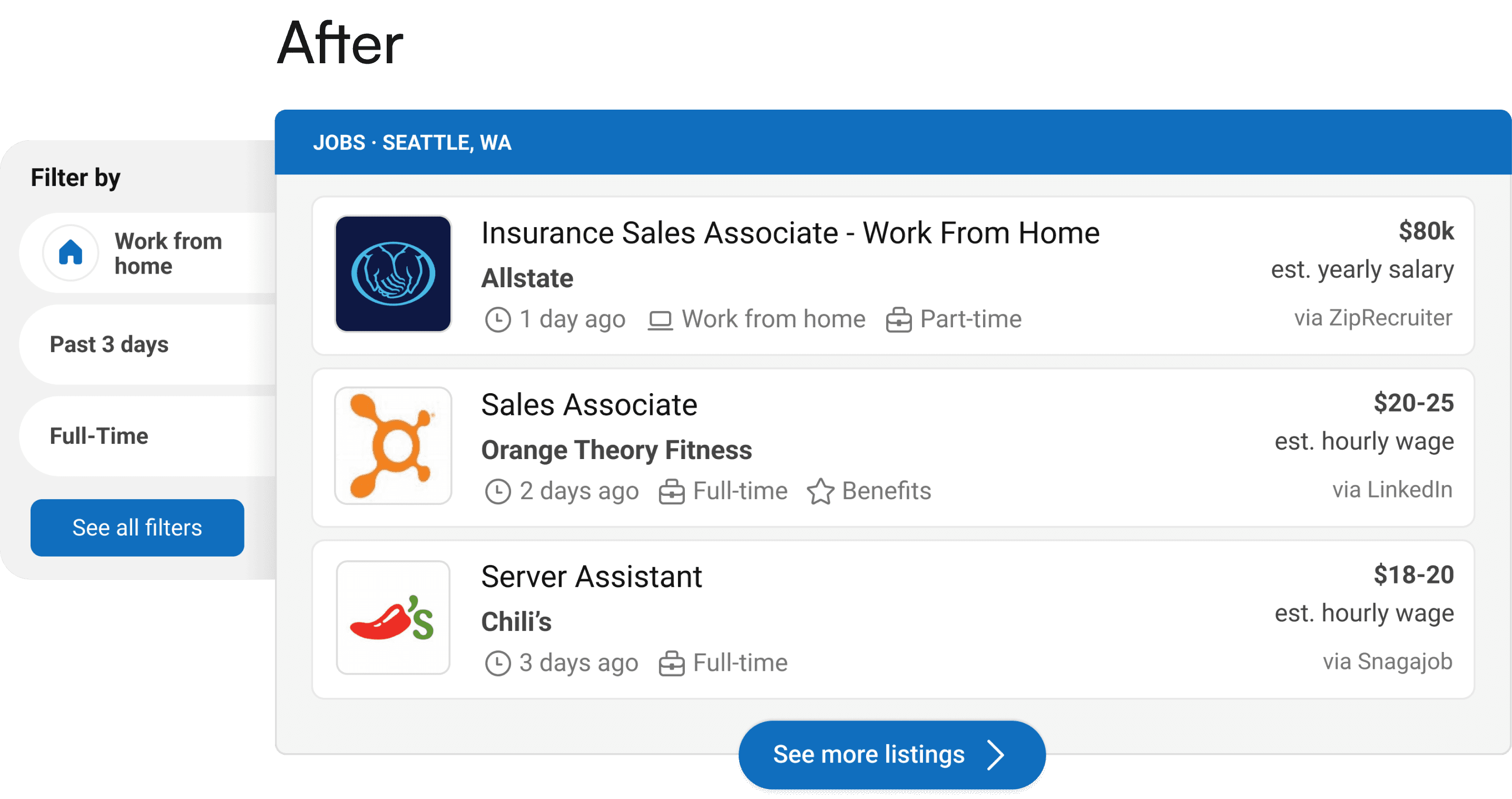
By making all these changes, our answer was now able to provide additional data as well as show three full job cards as opposed to two.
Users can now scan information more easily, making it easier for them to search for their targeted jobs and as a result, increase our vertical's clicks.

Reduced card height

Created a widget for filters

Removed location from cards

Changed filled icons to outlined
After finalizing on concepts and mocks, I decided it was time to do some research to validate my design decisions. I used our company's crowd-sourced research platform to compare the original and updated designs on Bing's whole page with 100 judges.
Scenario:
Imagine you are on Bing and are searching for jobs near you. Which design do you prefer? Provide a brief explanation for your choice.
Concept B won by a Significant Margin (P<0.001) based on 100 global judgments
What users who chose Concept B had to say:
"Both have almost the same information about jobs but the difference in format makes a big difference."
"It's easier to find information with the icons as I can immediately identify the details and is also more visually appealing."
"I prefer Concept B because it highlights important information. There are so many jobs out there to sift through that any information that can be processed quickly is helpful."
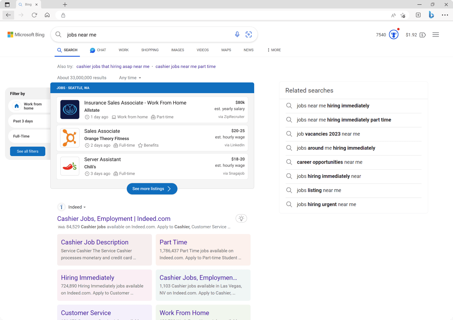
Our new Jobs answer:
In retrospect…
Although our team shipped the new experience, our work wasn't finished. We had also discussed other ways we could continue to improve the job search experience for our users, from goals like leveraging the use of white space on Bing to expand our answer to new and exciting features like adding an interactive map.
Project takeaways:


